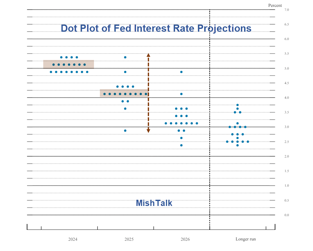
The Fed delivered its expected statement at today’s FOMC meeting. All eyes were instead on the “Dot Plot” of interest rate projections for 2024 and 2025.
The Fed’s FOMC Statement is barely worth a look. Here are the first three paragraphs.
Recent indicators suggest that economic activity has continued to expand at a solid pace. Job gains have remained strong, and the unemployment rate has remained low. Inflation has eased over the past year but remains elevated. In recent months, there has been modest further progress toward the Committee’s 2 percent inflation objective.
The Committee seeks to achieve maximum employment and inflation at the rate of 2 percent over the longer run. The Committee judges that the risks to achieving its employment and inflation goals have moved toward better balance over the past year. The economic outlook is uncertain, and the Committee remains highly attentive to inflation risks.
In support of its goals, the Committee decided to maintain the target range for the federal funds rate at 5-1/4 to 5-1/2 percent. In considering any adjustments to the target range for the federal funds rate, the Committee will carefully assess incoming data, the evolving outlook, and the balance of risks.
All Eyes on the Dot Plot
All eyes are on the Fed’s dot plot, and Summary of Economic Projections (SEP), despite the fact that the SEP has been radically wrong way more often than not.
The Fed is essentially clueless. Look no further than its interest rate range from 2.75 percent to 5.50 percent for 2025.
This is best translated as “We have no idea, but we insist on saying so.”
Nonetheless, all the Fed watchers are taking this in looking to front run the trade, whatever it is.
I fail to see how this is at all helpful and suggest the Fed instead focus on the near-term. Then again, the Fed failed to predict the immediate inflationary impact of the most QE in the history coupled with the biggest fiscal stimulus in the world.
Since the Fed cannot see what’s in front of its nose, perhaps the way to hide that is to make projections for 2026 and beyond.
Monthly Jobs Reports Margins of Error
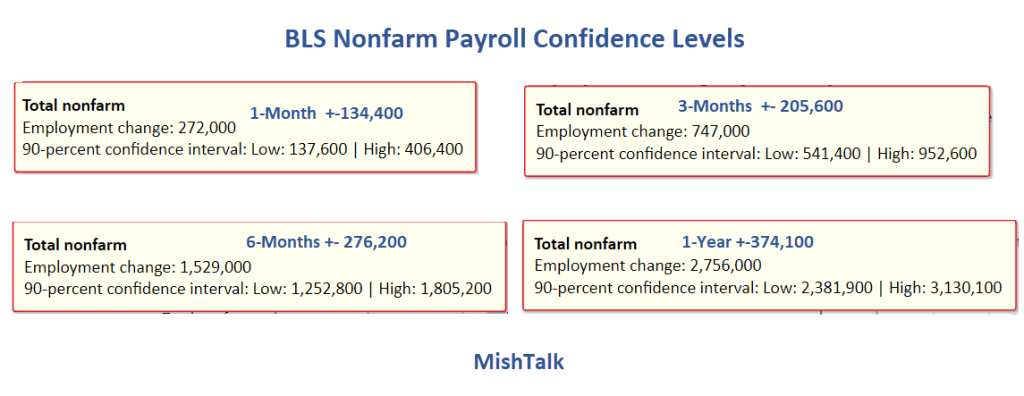
Those numbers are for the first release. The numbers vary slightly by revision.
Yesterday, I asked What Are the Margins of Error in the BLS Monthly Jobs Reports?
In a range of 137,600 to 406,400 how can the Fed say with confidence that “economic activity has continued to expand at a solid pace. Job gains have remained strong.”
How Much Does the BLS Overstate Monthly Jobs?
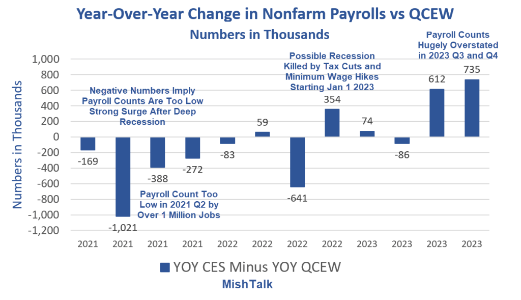
Note: The numbers in all of my charts are unadjusted. They need to be because QCEW numbers are not seasonally adjusted.
The QCEW (Quarterly Census of Employment and Wages) is a count of Unemployment Insurance (UI) administrative records submitted by 11.9 million establishments. That’s about 99 percent of the data.
Nonfarm Payrolls are are from the Establishment Survey (CES). The sample survey was 666,000 individual worksites in 2023. That’s about 5.6 percent of the data.
I discussed above QCEW chart on June 6 in How Much Does the BLS Overstate Monthly Jobs? Here’s the Answer
In retrospect, by “overstate” I should say “differ” although in this case I am confident overstate is correct.
CES vs QCEW Full Year 2023
- CES: 155,211,000 to 158,269,000 (+3.06 million)
- QCEW: 152,525,000 to 154,848,000 (+2.32 million)
I do not have confidence levels on QCEW but they should be much more accurate than CES.
For the full year, the difference between QCEW and CES is 735,000.
The Fed is confident about 5.6 percent of the data, ignoring the message of 99 percent of the data.
Payrolls Rise 272,000 Employment Drop 408,000
The data is confusing and conflicting in many ways.
For discussion, please see Another Bizarro Jobs Report – Payrolls Rise 272,000 Employment Drop 408,000
Nonfarm Payrolls vs Employment Gains Since May 2023
- Nonfarm Payrolls: 2,756,000
- Employment Level: +376,000
- Full-Time Employment: -1,163,000
In the last year, jobs are up 2.8 million while full-time employment is down 1.2 million
Similarly, there is a huge discrepancy between Gross Domestic Product (GDP) vs Gross Domestic Income (GDI)
Real GDP vs Real GDI
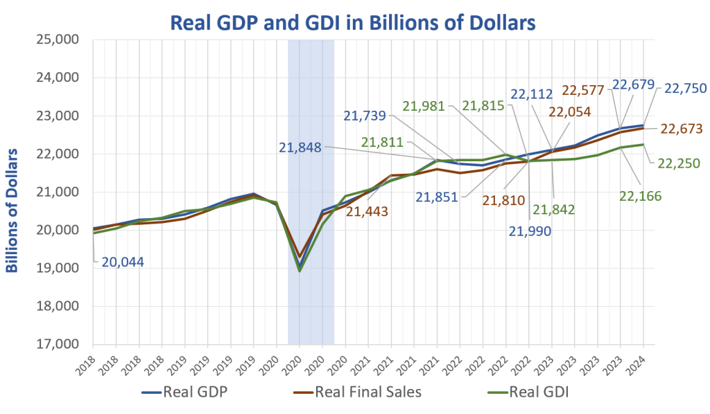
GDP and GDI are two measures of the same thing. Income received should match product produced.
However, income is historically low vs GDP
For discussion of the GDP-GDI discrepancy, please see More Soft Economic Data, Q1 GDP Revised Lower, Q4 GDI Significantly Lower
GDI lends credence to the idea that the household survey (employment) is correct, not the CES establishment survey (nonfarm payrolls) with its assumed birth-death adjustments.
Importantly, QCEW fits in the picture as well.
QCEW, the Household Survey employment numbers, and GDI are in sync. The outlier is the nonfarm payroll report.
On that basis, coupled with weakening trends in hard data, I repeat my unpopular opinion: A Second-Quarter Recession This Year Looks Increasingly Likely
The Fed seems confident about the short term. I suggest they should be as confident about 2024 as they are about 2025, and that translates to no confidence at all.